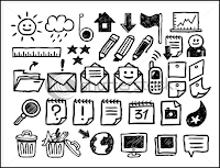
I like the idea of these icons looking hand drawn
I think these icons look really good, but the colour used makes them look very serious and professional.
These look like typical smartphone icons.
I like the detail behind these icons, but the cartoon style in which they’ve been created is a bit childlike. For icons that need to be bigger on the calendar app, I think detail is quite important without being overly intricate.
These icons are not as effective, but I was really attracted to the little pentil and paint brush, that could be a symbol for allocated time to be creative.
These are examples of iPhone app symbols. There are ones that I think are really effective in the context of our idea like the little slice of pizza could be a symbol for having a takeaway and the speakers could be a symbol for a houseparty.
The shopping trolley on this works well and would work well as a symbol for going food shopping, something that every student needs to do.


No comments:
Post a Comment