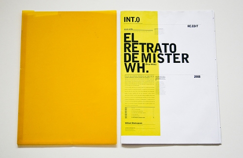
For the inside of y publication i want it to be quite uniformed and have a really clean look to it, so start with i thought id have a look at some designs to get inspiration.
I like the minimal look of these next few designs, there is a lot of white space around the text and image and i think it works really well, given everything space and room to breathe.


No comments:
Post a Comment